DealCart – Rethinking Rewards for Pakistan’s Price-Conscious Shoppers
DealCart is a mobile-first, social commerce platform that enables group buying for grocery essentials in Pakistan. While the platform gained traction quickly, the rewards system lacked clarity and structure — leaving both engagement and retention untapped.
Roles:
- UX Strategy
- Sprint Planning & Facilitation
- User Research
- Rewards Experience Design
- Mobile App UX/UI
- Developer Handoff
- UX Strategy
- Sprint Planning & Facilitation
- User Research
- Rewards Experience Design
- Mobile App UX/UI
- Developer Handoff
Gaps We Couldn't Ignore
Despite DealCart’s strong product-market fit, the rewards experience was disconnected, underwhelming, and failed to influence user behavior at scale.
the core gaps:
- SCATTERED REWARDS JOURNEY
- The experience was fragmented. Coins, games, referrals, and bonuses were spread across the app without a clear, unified system.
- NO BEHAVIORAL MOMENTUM
- The screen didn’t guide users toward key actions like sharing, playing, saving more, or reordering. It simply existed, without nudges or motivation.
- INFORMATION OVERLOAD & CONFUSION
- Users were confused between “Total Kamayi,” balance, and usage breakdown, leading to low trust in the system.
- EMOTIONAL DISCONNECT
- 80% of users didn’t feel good about rewards. The design lacked a sense of progress, achievement, or delight, critical for retention and re-engagement
- LOW VISIBILITY OF KEY MOMENTS
- Only 4% accessed their profile — where fuel savings and other motivators were displayed.
- UNSCALABLE DESIGN SYSTEM
- The existing design couldn’t support future reward types, tiers, promos, or quests without breaking the experience.
Designing with Intention
We weren’t just improving how rewards looked — we were rethinking their purpose in the product journey. The goal was to make rewards part of a habit, not a one-time feature. That meant building a system that nudges behavior, celebrates savings, and keeps users coming back.
We focused on three key outcomes:
- Increase return visits through visible progress, reminders, and rewards that feel earned
- Drive repeat orders by linking coins and promos to real shopping actions.
- Make savings feel satisfying with better visibility, emotional feedback, and history.
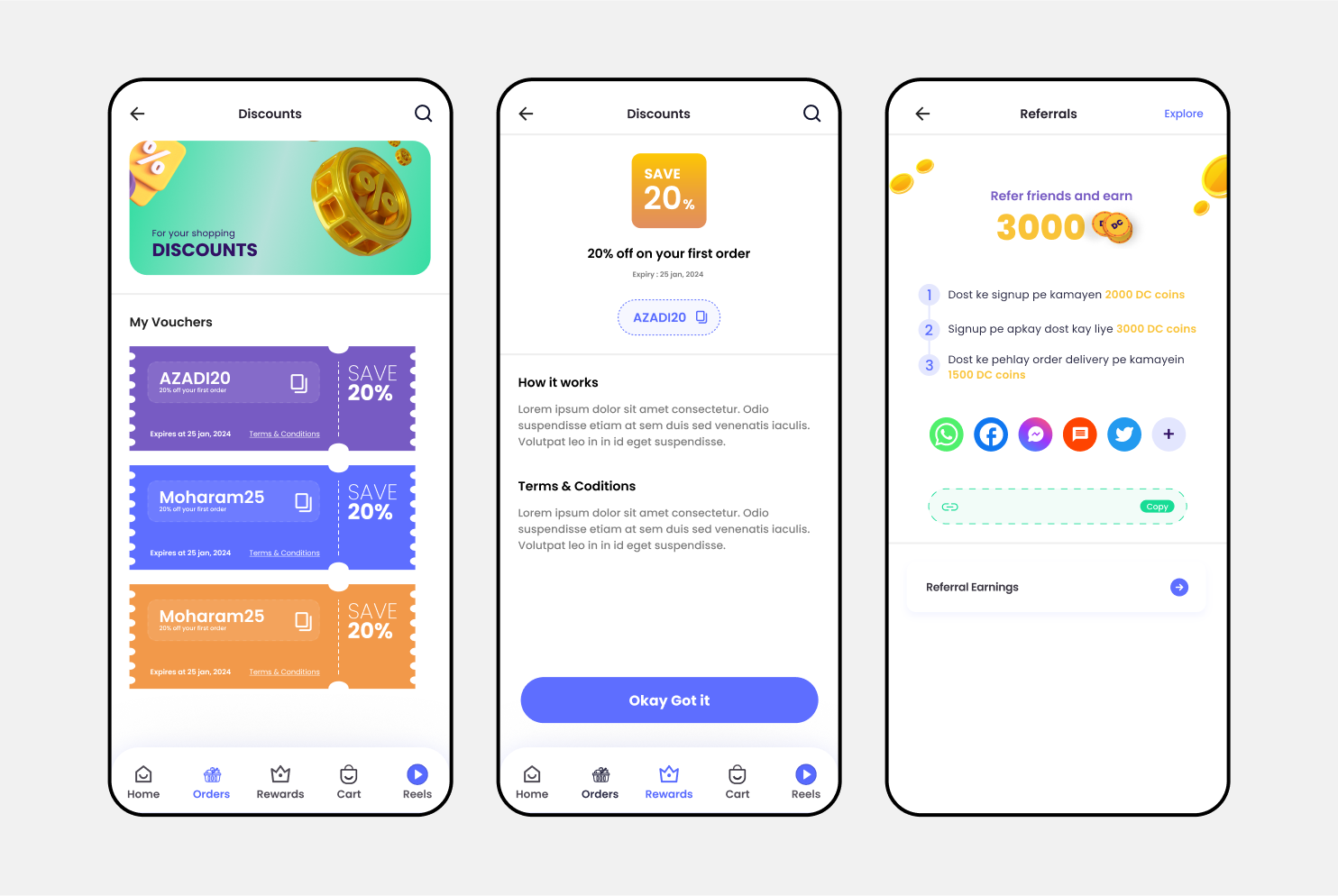
- Encourage social sharing through referral-based incentives and group triggers.
- Create a scalable system that supports games, quests, vouchers, and new reward types.
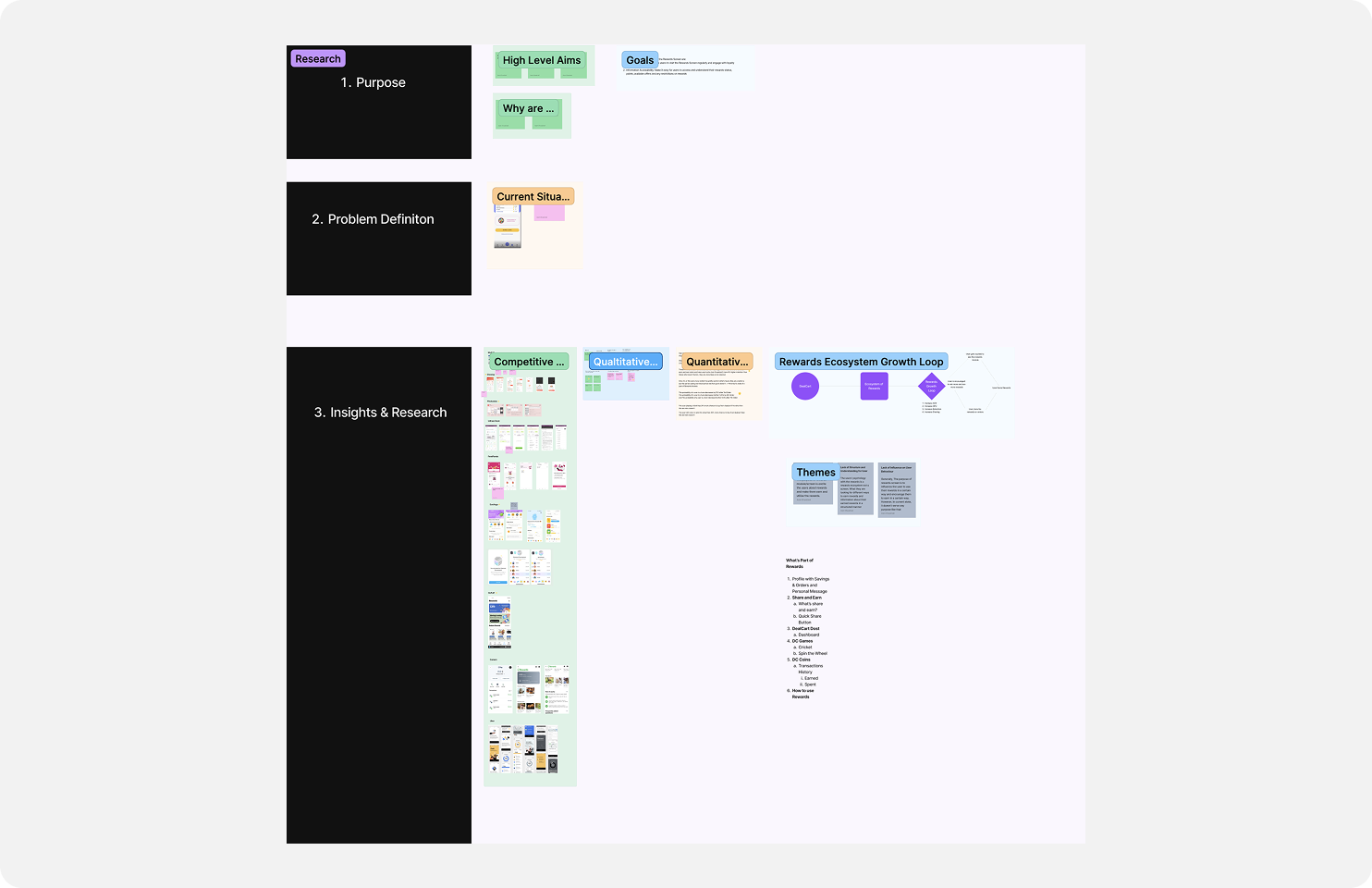
What We Learned from Real People
To redesign the rewards experience meaningfully, we needed to understand how users perceived it — what excited them, what confused them, and what made them come back.
We gathered insights through:
- Sprint-driven expert interviews
- In-app behavior analysis
- Team-generated HMWs (How Might We questions)
- User sentiment breakdowns
- Sprint-driven expert interviews
- In-app behavior analysis
- Team-generated HMWs (How Might We questions)
- User sentiment breakdowns
Users were confused and disconnected
- 80% of users said the rewards screen didn’t feel “good” or exciting
- 75% couldn’t track how or where their DC Coins were earned or spent
- 60% were unclear about their “Total Kamayi” vs usable balance
- I’d rather use WhatsApp because at least I can talk to someone directly.
They wanted clarity and control
- Users wanted a clear breakdown of earnings, redemptions, and expiry.
- Many expected reward history and transaction logs in one place.
- Limits and rules about coin usage weren’t visible — only discovered after trying to redeem.
Emotion and motivation were missing
- The existing experience lacked any sense of progress, reward feedback, or delight
- Only 4% of users visited their profile to see savings, missingout on emotional reinforcement
When rewards worked, they worked well
- Users who played a game and used their coins were 6% more likely to retain
- Winners of Spin the Wheel were 40% more likely to place an order
- Cricket game winners had a 31% higher conversion rate than non-players
Translating Insight into Experience
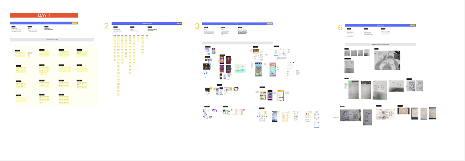
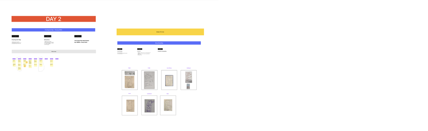
Running a Focused Design Sprint
To align the team and move fast on solving rewards-related issues, we ran a 2-day focused design sprint involving stakeholders from Product, Tech, CX, and Design.
The sprint helped us:
- Define long-term goals and user behavior challenges
- Map the current reward flow and identify drop-off points
- Collect 60+ HMW (How Might We) statements across multiple themes
- Prioritize problems using voting sessions.
- Align on the core problem: lack of clarity, motivation, and structure in the rewards system
Our Sprint Objectives:
- Unify the rewards experience into a single hub users could return to.
- Introduce behavioral hooks like progress, streaks, and milestones.
- Surface saving potential clearly with transaction visibility and feedback.
- Connect rewards with engagement — games, referrals, orders, sharing.
- Design for scale — future games, vouchers, promos, and NMR features.
Solution guidelines
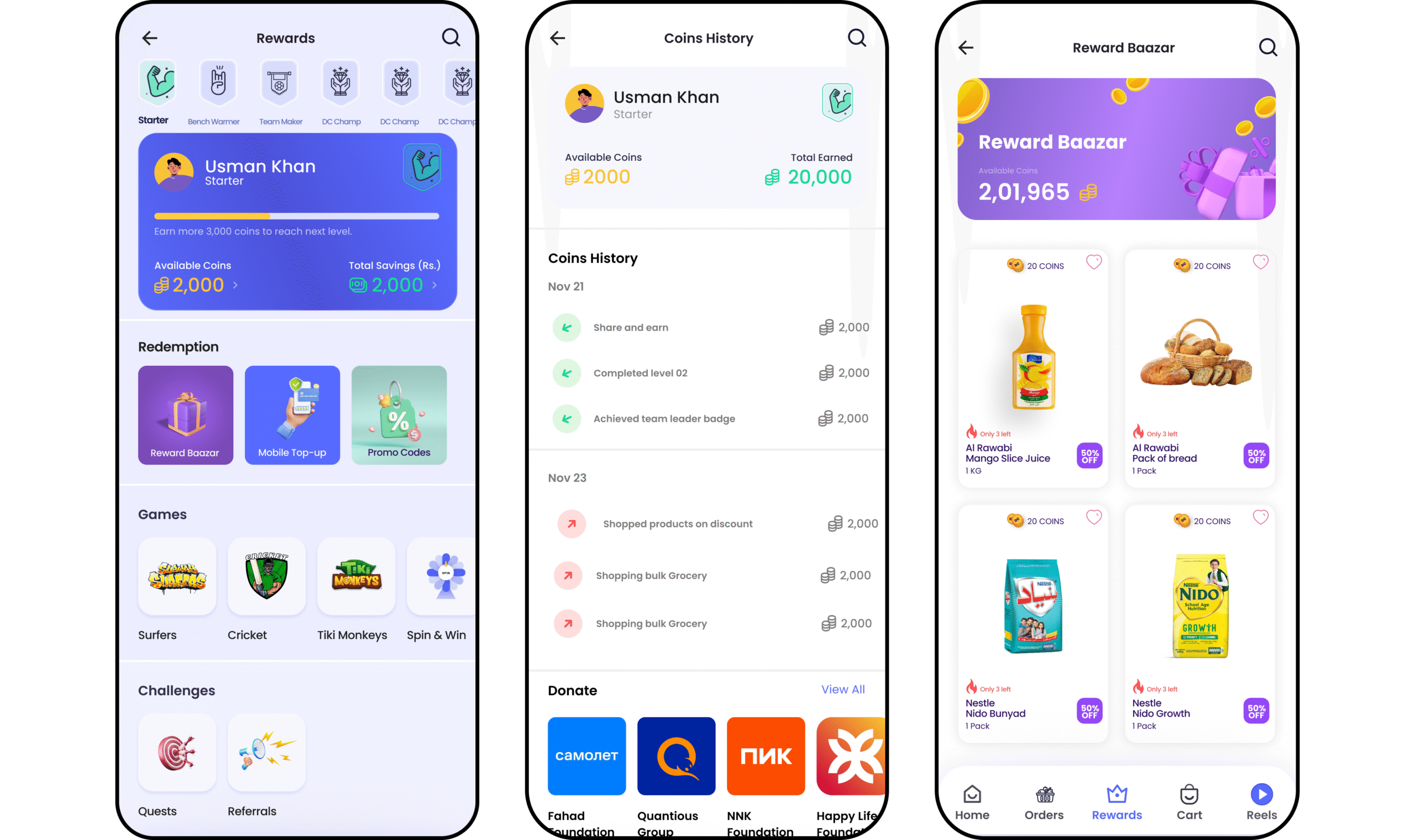
- One rewards hub - unified all reward sources and actions.
- Clear coin breakdown - earned, spent, remaining, and expired.
- Action-based rewards - coins tied to sharing, games, referrals.
- Connect rewards with engagement — games, referrals, orders, sharing.
- Scalable design system - built to support future features
Rethinking Rewards Through UX
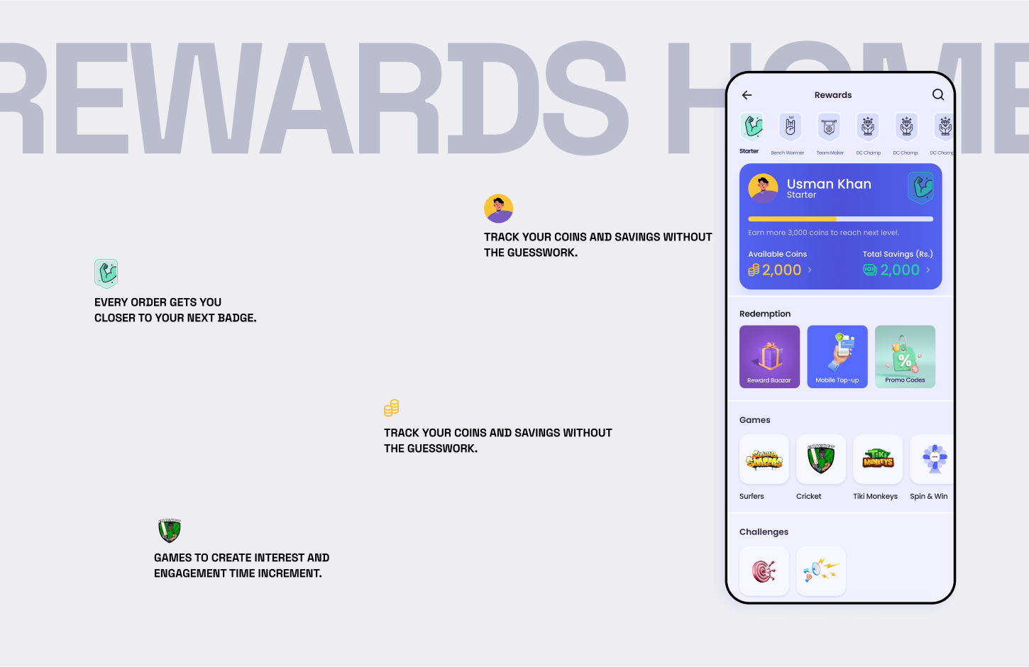
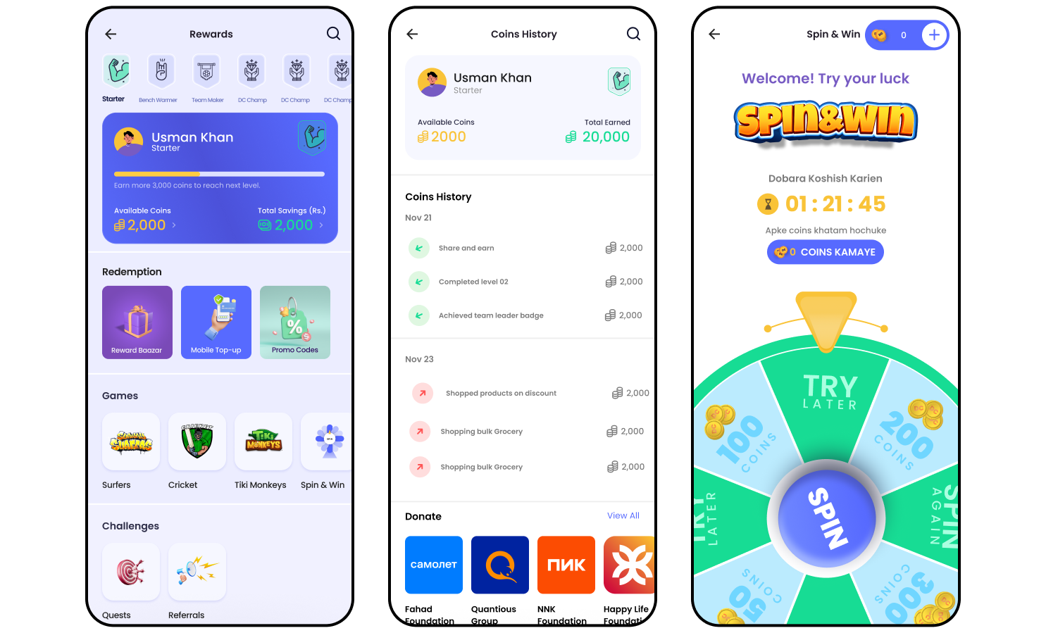
Rewards Hub
Impact & reflection
- INCREASED ENGAGEMENT
- Increased engagement on the rewards screen through clearer coin visibility and action-driven rewards
- IMPROVED RETENTION SIGNALS
- Improved retention signals, especially in users who interacted with Spin to Win and referrals
We learned that rewards only work when they’re clear, earned, and emotionally felt. Structure, transparency, and collaboration turned a confusing screen into a habit-building experience.